> For the complete documentation index, see [llms.txt](https://docs.tryterra.co/llms.txt). Markdown versions of documentation pages are available by appending `.md` to page URLs; this page is available as [Markdown](https://docs.tryterra.co/graphs/graphs.md).
# Overview
Build a chart of your users' health data in the Terra dashboard, then drop it into your product.
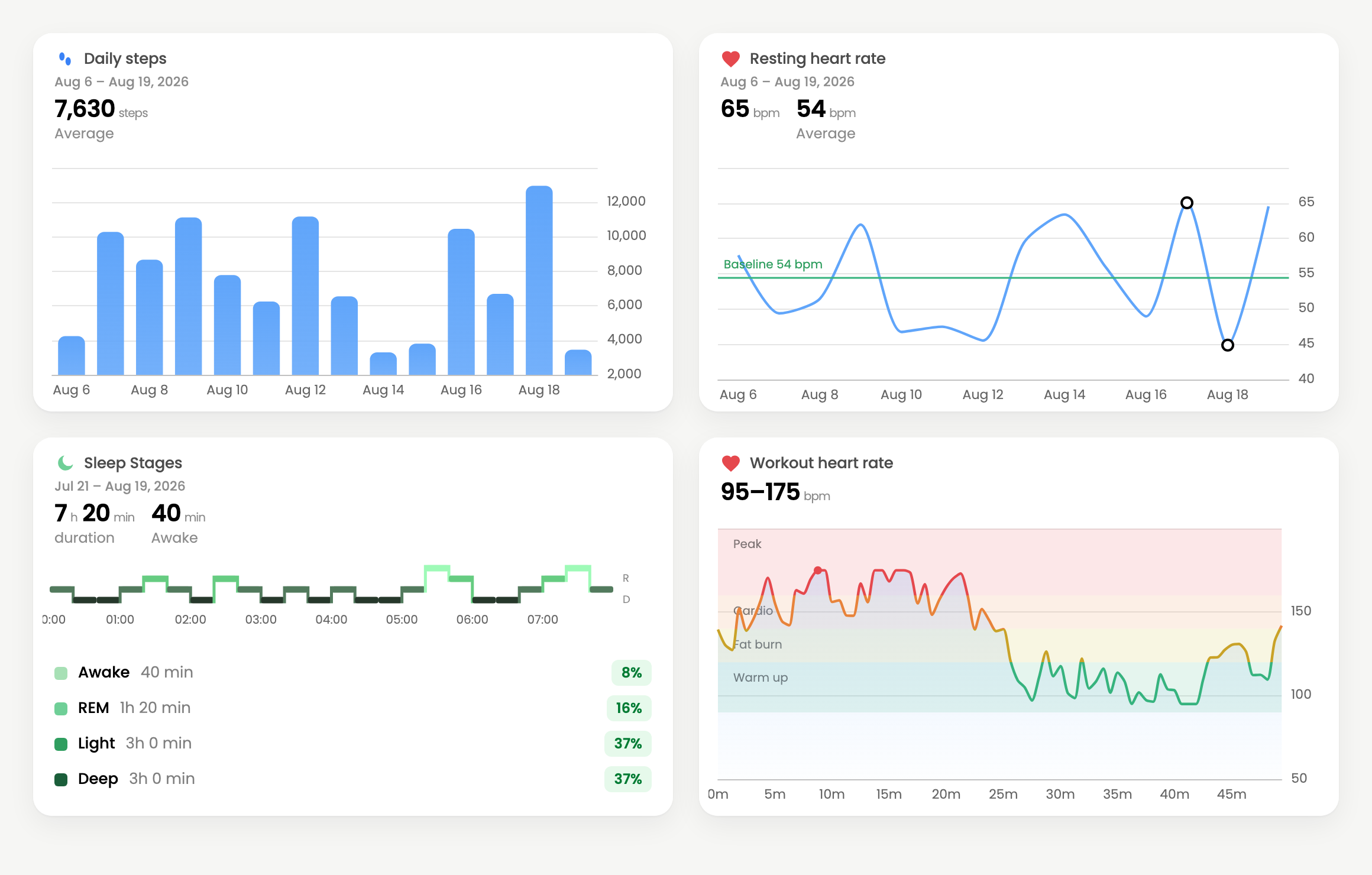
Graphs turn a user's health data into a chart you can put in your product — steps, resting heart rate, glucose, sleep stages, or any other field Terra collects.
You build each graph once in the Terra dashboard: pick the metric, choose a style, set the colours. Terra gives you an id. Your app renders that graph for whichever user is looking at it.
Four graphs, all built in the dashboard with no code
Nothing about a graph's design lives in your codebase. Change the metric, the chart type or the colours in the dashboard and every embed updates — no deploy, no release.
{% hint style="info" %}
Graphs are an add-on. If you don't see them in your dashboard yet, open **Graphs** and choose **Unlock Graph API**, or talk to your account manager.
{% endhint %}
***
## Build your first graph
{% stepper %}
{% step %}
#### Open Graphs and create one
Go to [**Dashboard → Graphs**](https://dashboard.tryterra.co/dashboard/graphs) and choose **New graph**. An editor opens with a live preview beside it, drawn with generated data so you can see the result immediately.
{% endstep %}
{% step %}
#### Choose what to plot
Under **Data**, pick one of:
* **Metric** — any numeric field Terra collects. Search for what you want (`Steps`, `Resting HR`, `Glucose`) and select it. Add more to plot them together, each as a line or a bar: daily summaries combine freely, and sampled metrics from the same record — heart rate and power from one workout — overlay. Picking something that can't share an axis with your current selection replaces it rather than adding to it.
* **Specialty** — a pre-built chart that combines several fields into one designed layout: sleep stages, a macro breakdown, or an ambulatory glucose profile.
For metrics recorded as continuous samples — heart rate during a workout, glucose through the day — a **Scope** control appears. **Over time** trends the metric across your whole date range. **Single session** zooms into the most recent workout, night or day, and keeps following the latest one as new data arrives.
{% endstep %}
{% step %}
#### Style it
**Quick style** applies a complete look in one click, and the options offered depend on what you picked:
| Quick style | What it shows |
| -------------------- | ------------------------------------------------------------------------------------------ |
| **Minimal** | Icon, title, and the latest value. |
| **Stats + baseline** | Average, lowest and highest, with an average reference line and the extremes marked. |
| **Heart-rate zones** | Training-zone bands behind the line, with the peak marked. Offered for heart-rate metrics. |
| **Min/max range** | Per-day min/max whiskers with a range in the header. Offered for sampled metrics. |
Everything a quick style sets stays editable underneath it, so you can start from one and adjust. Under **Theme**, pick a preset — Light, Midnight, Forest, Sunset, Plum, Mono — or set the background, line, text and tick colours yourself. The preview restyles as you go.
Give the graph a **Title** if you want something other than the metric name.
{% endstep %}
{% step %}
#### Save it and copy the id
Choose **Save**. The graph appears as a card on the Graphs page. Select **Embed** on the card to get its id along with ready-made snippets.
That id is all your app needs.
{% endstep %}
{% endstepper %}
***
## Show it to a user
A graph is a template — you build one and render it for each of your users. Rendering takes two ids:
* the **graph id**, from the dashboard
* a **user id**, the Terra user whose data to draw
{% tabs %}
{% tab title="React" %}
```bash
npm install @tryterra/graphs-react
```
```jsx
import { TerraGraph } from "@tryterra/graphs-react";
```
{% endtab %}
{% tab title="HTML" %}
```bash
npm install @tryterra/graphs
```
```html
```
{% endtab %}
{% tab title="iframe" %}
```html
```
{% endtab %}
{% endtabs %}
Use `example` in place of a user id to render generated data — useful while you build the layout, before you have a connected user.
React Native draws graphs natively with its own package; Vue, Svelte, Angular, iOS, Android and Flutter are all covered in [Embedding graphs](/graphs/embedding.md).
***
## Who can see a graph
The graph id and user id both go in your frontend, and neither is a credential — your API key stays on your server.
A graph renders only for users connected to your Terra account, and only that user's data. But anyone holding both ids can load the chart, so treat an embed URL the way you'd treat a link to a shared document: fine to give the person whose data it is, not something to publish. Render each user's graph with their own id, and don't put embed URLs anywhere a different user could pick them up.
The **Viewers** action on a graph card shows which of your users have loaded it, and when.
***
## What a graph can plot
Almost anything Terra collects. The metric picker searches every numeric field across activities, dailies, sleep, body and nutrition, so if a value appears in a Terra payload you can chart it. Some common ones:
| Data type | Examples |
| ------------- | ----------------------------------------------------------------------------- |
| **Daily** | Steps, distance, active calories, resting heart rate, stress |
| **Sleep** | Time asleep, REM/light/deep duration, sleep heart rate, HRV, respiratory rate |
| **Activity** | Heart rate, power, cadence, speed, elevation, calories |
| **Body** | Glucose, weight, blood pressure, SpO₂, temperature |
| **Nutrition** | Calories, macros, water, individual micronutrients |
Specialty graphs cover the charts that need more than one field: **sleep stages** as a hypnogram with a stage breakdown, **macro breakdown** as stacked daily macros against calories, and **ambulatory glucose profile** as percentile bands across the day.
{% hint style="info" %}
A graph draws the data Terra already holds for that user. If a chart looks empty, the usual cause is that no data has arrived for that date range yet — check the user in [**Dashboard → Users**](https://dashboard.tryterra.co/dashboard/users).
{% endhint %}
***
## Next
* [**Embedding graphs**](/graphs/embedding.md) — every framework, React Native and mobile, date ranges, theming, and what to do when a graph doesn't render.